The Flexbox Model still contains the major elements of the Box Model (margin, padding, border and content), but offers flexibility to best fill the space with the container’s/parent’s children.
This tutorial will help you to understand the flexbox module a bit better so you can start to make your sites more responsive.
The following is starter code for a basic flexbox model demonstration – please follow along as we talk about flexbox!
<!DOCTYPE html>
  <head>
    <title>Flexbox</title>
    <style>
       * {
        	box-sizing: border-box;
        	font-family: 'Roboto'
       }
      .parent-container {
        	height: 700px;
        	background: green;
        	width: 700px;
        	padding: 20px;
      }
      .child-item {
        	height: 200px;
        	width: 200px;
        	margin: 0px;
        	padding: 20px;
      }
      .child-item:first-child {
        background: orange;
      }

      .child-item.one {
        background: purple;
      }
      .child-item.two {
        background: aliceblue;
      }
      .child-item.three {
        background: grey;
      }
      .child-item.four {
        background: pink;
      }
      .child-item.five {
        background: yellowgreen;
      }
      .child-item.six {
        background: red;
      }
      .child-item.seven {
        background: blanchedalmond;
      }
      .child-item.eight {
        background: white;
      }
      .child-item.nine {
        background: lightblue;
      }
      .child-item.nine {
        background: darkred;
      }
      .child-item:last-child {
        background: yellow;
      }

	</style>
 </head>
 <body>
  	<div class="parent-container">
		<div class="child-item">Lisa Simpson</div>
        	<div class="child-item one">Bart Simpson</div>
        	<div class="child-item two">Maggie Simpson</div>
        	<div class="child-item three">Homer Simpson</div>
        	<div class="child-item four">Marge Simpson</div>
        	<div class="child-item five">Grampa Simpson</div>
        	<div class="child-item six">Santa's Little Helper</div>
        	<div class="child-item seven">Apu Nahasapeemapetilon</div>
        	<div class="child-item eight">Moe Szyslak</div>
        	<div class="child-item nine">Ned Flanders</div>
        	<div class="child-item ten">Snowball II</div>
    </div>

	<script src="" async defer></script>
 </body>
</html>
Parent Container (Flexbox) Properties
display: flex The display property has several values we can use to position our containers on the screen. You may have seen block, inline-block, none, hidden, inline already, but the one we are going to focus on right now is called flex.
👉 First, what I would like you to do is envision a large container – a treasure chest, a toy box or a cardboard box – and then imagine putting items inside the container. The large container is what we call the parent or flexbox and the smaller items that go inside the container are the children or flex items.
When we add display:flex to a parent container, the property is assigned to that container and that container alone – the children do not inherit the property (however, they can use the property for their own containers that will affect their children).
This property opens all kinds of other properties we can use that we were not able to before: flex-direction, justify-content, align-items, align-self, flex-wrap and flex-flow.
Run the code editor above. Right now, you should see a large green container, the parent container, and 11 smaller containers, the child containers, inside the parent.
👉 The orientation of the child containers are on top of each other because the default is display: block. If you recall, when we use display: block, the container takes up the entire row it’s in. The margin’s default expands to the width of the parent container, resulting in both child containers being on top of each other.
👉 In contrast, using display: flex allows us to easily position the child containers any way we like in the parent container without having to use older box model properties like float and vertical-align.
🤖 Now try adding display: flex to the CSS in the style tag in the code editor so that the parent container’s CSS looks like this:
.parent-container {
height: 700px;
background: green;
width: 700px;
padding: 20px;
display: flex;
Adding display: flex to the .parent-container will result in a change to the orientation of the child containers. Once you hit , you should now see the child containers side-by-side.
By using display: flex instead of display: block, the default margin is set to 0. We can then manipulate it however we see fit!
flex-direction
🛑 The flex-direction property sets up the main axis of our container. The default setting in the flex container is row. When setting up the parent container with display:flex, there is no need to establish a flex-direction unless you need your content to be in a column.
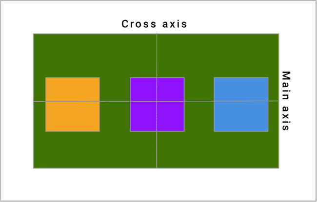
👉 The main axis in the default direction is left to right and the cross axis is top to bottom, as seen here:
 🛑 flex-direction: row establishes the main axis from left to right and the cross axis from top to bottom.
Now add flex-direction: column to the .parent-container in code. What happens when you press?
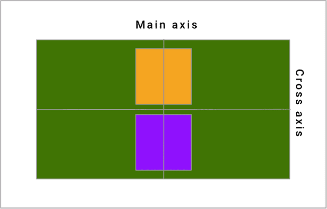
👉 It seems to be that the axes flip when we switch flex-direction to column: what was our main axis becomes the cross axis and then what was our cross axis becomes the main axis, as illustrated below:
flex-direction: row establishes the main axis from left to right and the cross axis from top to bottom. Let’s try adding flex-direction: column to our .parent-container in the code editor above. What happens when you press?
It seems to be that the axes flip when we switch flex-direction to column: what was our main axis becomes the cross axis and then what was our cross axis becomes the main axis, as illustrated below:
🛑 flex-direction: column establishes the main axis from top to bottom and the cross axis from left to right. As a result, our children containers in our example flipped their axes! So now the child containers are once again on top of each other.
🛑 The main to remember about flex-direction is that the direction of the main axis corresponds to the value of your flex-direction property (column is top to bottom, row is left to right).
Justify-content concerns itself with the spacing on the main axis and align-items concerns itself with spacing around the cross axis. We’ll get into those properties a little later.
👉 There are two other possibilities for flex-direction: row-reverse and column-reverse. These properties are very similar to row and column, but the flex-itemsare laid in a reverse order, right to left, in the case of row-reverse, and bottom to top for column-reverse.
The use case for these particular values comes when you need to have a different layout or order on your page from web to mobile or tablet.
flex-wrap
🛑So far we have learned how display: flex affects a parent’s child containers and then how to manipulate the flow of those child containers in a row or in a column. What if the size of the parent runs out of room? What happens? And how can we fix it?
👉 The answer comes in the form of the property called flex-wrap. By default, flex-wrap is set to nowrap. This means that the child containers can overflow the parent container, causing unwanted layout problems. Let’s try adding flex-wrap: wrap; to the .parent-container and see what happens in your code.
flex-wrap: wrap makes sure that the contents of the main container don’t go outside that container’s border. 👉 The layout of the container will be much nicer. Flex-wrap will take all the children components, lay them side by side until it hits the width of the parent container and then move to the next row to add more child containers to repeat the process until all of the containers have been displayed.
🛑 Flex-wrap has three available properties: nowrap, wrap and wrap-reverse. wrap-reverse is the same as wrap except that it flows bottom to top instead of top to bottom.
flex-flow
Flex-flow is shorthand for flex-direction and flex-wrap. The syntax is flex-flow: column wrap if you would like your flex-direction to be column and your flex-wrap to be wrap. flex-flow: row nowrap is the default value.
justify-content
🛑 The justify content property is concerned with alignment along the main axis of the parent container. 👉 It helps to distribute your flex-items across the main axis without you having to calculate the space needed. The six most commonly used property values for justify-content are flex-start (the default), flex-end, center, space-around, space-between and space-evenly.
